Hey everyone,
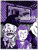
I'm uploading a sketch I made of the poster for the two events in Jerusalem next month.
I changed the format to A3, I thought this could work better. The text is still not there because we need to match the English and Hebrew texts so they would say the same, and it's not done yet.
So, what do you say?
Nitzan

3 Kommentare:
Hi! Ok, good that this is coming along. So my comment, a short one: With a different type it would look better. Have you got Felix' original posters? Why not work on those there with the type, thats the only thing that still needs a bit of work … But maybe you can get some reactions from Felix, because we have to get this done as soon as possible!
All the best,
Johannes.
Are you talking about the font? I really thought the other font was too heavy and not good. I really like this one, but I can try other ones, i suppose...
Nitzan
Godd Morning ;
i would prefer a Landscape Format in A3. We should make two versions: A landscape format in A3 and a large portrait format like my first Layout .
We can print many of the Landsape ( its cheaper ) and just a few batch from the large portrait, for example as an eye catcher for special places.
About the Layout: In my opinion the balance beetween the Areas - Pictures and Letters - is not ideal. The poster is to heavy in the upper area.
Another Point is that you dont find a solution for the bavarian. He just apears out of nothing. If both are upside down ( like in my landscape version) they come out of the frame.
I agree with Johannes: please try just to "pimp" the old version.
Ok ?
Yours Felix
Kommentar veröffentlichen